Friday, 13 March 2009
Wednesday, 11 March 2009
Improvements
There were no consistent points made throughout the improvement points, however a variation of opinions towards our opening sequence were made.
- The titles could be brighter and more appealing
- Could have developed on the narrative at the beginning, as it did not seem to fit too well
- To some, the storyline could have been made clearer
- More narrative could have been used
Labels: Rowena Natasha And Ruby
Strengths
Much of the feedback we received from the viewers of our opening sequence has proved extremely insightful as it showed a variation of responses. The most consistent strength point proved to be on the topic of our effects, and how the audience thought it worked well on the overlaying images and short action scenes.
The location was also mentioned as a strong point towards our opening sequence, along with ;
- Build up of music, how it worked well with the titles
- Appropriate titles
- Original ideas
- Fluent scenes from the train to the motion shots
- Facial close ups
- How it can be imagined as a realistic opening to a whole film
Labels: Natasha And Ruby, Rowena
Tuesday, 10 March 2009
Question one.
Question one; In what ways does your media product use, develop or challenge forms and conventions of real media products?
Our opening sequence contains subtle similar conventions to that of British cinema, the topic of mental health awareness and a problem that needs resolving are brought across in a surrealist effect.
Scenes such as close ups following the characters journey give the feeling of tension and wonder towards the audience, this enhances the storyline following her amnesia and produces a minor story following up to her accident. Many British films themselves are based upon character with a problem or a situation needed to be resolved, and a lot of scenes may contain little or no dialogue and will shortly focus on the characters actions to promote the storyline.
For comparison, the british film 'CashBack' written by Sean Ellis, tells a story of a boy who develops insomnia after losing his girlfriend however , resolves the situation by gaining a night job at his local supermarket. The story focuses on the people he meets and those he knew, proving extremely effective as the audience feel they already know the character. Strong narrative points also increase the relationship between audience and main character.
Wednesday, 4 March 2009
Edited rough cut
Recently after putting together our rough cut we decided on adding a different lighting effect 'light rays', to most of the scenes involving a figure.
This helps develop the mise en scene, whilst adding a better flow to the whole opening scene and increasing the attention on what could be going on with the figure.


Monday, 2 March 2009
MONDAY 9th MARCH - 9am - EVALUATION DRAFT TO MOODLE

MONDAY 9th MARCH - 9am - EVALUATION DRAFT TO MOODLE
Evaluation Questions
The following questions must be answered in your evaluation PowerPoint:
1. In what ways does your media product use, develop or challenge forms and conventions of real media products?
2. How does your media product represent particular social groups?
3. What kind of media institution might distribute your media product and why?
4. Who would be the audience for your media product?
5. How did you attract/address your audience?
6. What have you learnt about technologies from the process of constructing the product?
7. Looking back to your preliminary task, what do you feel that you have learnt in the progression from it to the full product?
Labels: S*A*T
Friday, 27 February 2009
Friday, 13 February 2009
Tuesday, 10 February 2009
Props
Here is the list of props we are going to use to create our opening sequence:
- Camera

- Old Photo Of 'Dad'

- Train

These are really the only props we are going to use. The rest of the images will be focusing on people and actions. This is to create a view on how the characters feelings and emotions are represented by having few props and just images of her and her memories.
Credits
During our opening sequence we are going to include the following opening credits:
- Reflex Productions Presents
- A film by Mazework Films
- Melanie Potts
- The film name
- James Smith
- Casting by Jack Harvey
- Music by Rachel Robinson
- Costumes designed by Marcus Riley
- Edited by Luke Ancliff
- Production designed by Harry Matthews
- Director of photography Kevin Baker
- Co Producer Oscar Lucas
- Co executive producer Martin Times
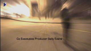
- Executive producer Sally Evans
- Written by Linda Ovens
- Produced by Ryan Jackson
- Directed by Hannah Blunt
Friday, 30 January 2009
Anamatic
Anamatic
Through our anamatic we are hoping to achieve an outlook onto the lifestyle of a young girl.
Part of the story tells of how she lives now, her new life and the setting around her however flashbacks will play into the scenes quite early on giving another view onto how she got there and her persona before she ran away.
Tuesday, 27 January 2009
Friday, 23 January 2009
Wednesday, 7 January 2009
Jumper Analysis
 Jumper Analysis
The film itself originally seemed to begin as a typical young action film studying the life of an extraordinary boy called David. We decided to analyse this opening sequence as the first few scenes help develop the overall film extremely well and really captivate the audience into watching the rest of the film.
Mise-en-scene
The first image that is brought across to the viewers eyes is David Rice appearing to be relaxed at great height in the centre of Egypt. This could bring across the impression that the rest of the film is set around this area but because of the story line the viewer begins to understand why the settings change rapidly. Following this scene is a flashback to when David was at 'high school' telling a seperate story of how he became a 'jumper'. The costumes and language from this scene have been purposley outdated to create a realistic effect of when he was younger. The lack of swearing and violence produces a more innocent outlook towards the characters ages and the costumes suggest that they are not old enough to have become very self concious within the high school.
Editing
The editing used within the opening scene is used to make the scene more intense as the change from when David is trapped in the frozen river to when he has 'jumped' to the libary. The editing is used here to make the viewer believe that it is more realistic where all the water is surrounding him once he has 'jumped'. Also in the opening scene, the usual match on action shots are used to make the scene flow with more ease and make it easier to follow.
Sound
There is quite a lot of non-diegetic sound used within the first scene. When it begins, the viewer can see David standing on a land mark but they can also hear what can be interpreted as his thoughts. Also when David falls into the frozen lake, The music builds up and creates more tension for the viewer which helps attract the viewers attention towards the film. Also there is Diegetic sound in the form of dialogue when the characters are relating to each other.
Camerawork
The camerawork is effective as it is shown from different angles such as when he is on


